


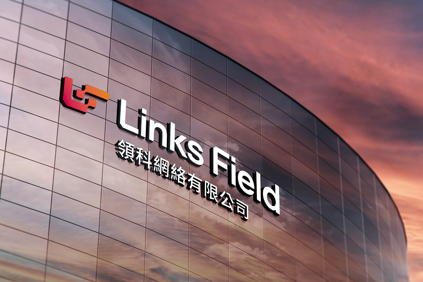
LINKS FIELD is a Chinese multinational company with offices in more than 10 countries. Its purpose is to make using Internet of Things connectivity easier. The company focuses on the growing world of IoT, seeking to innovate the way "things" connect, facilitating the expansion of various markets, such as vehicle telemetry, industry 4.0, smart cities, among others. With the redesign of the brand, the company was looking for a brand that symbolized connectivity, with a unique, modern and lasting design. The solution was to create a symbol with the brand's initials (LF) that would refer to connectivity (dots joining together) and also to the sim card (cut at 45 degrees). The typography was designed exclusively for the brand with cuts in the initials (sim card), rounded corners and the geometric letter K, bringing more personality to a sans serif that aims to be neutral and timeless.


Client: Links Field | Year: 2021 | Country: China
Service: visual identity with icon family and key visual, sim card design, website design.
____________________________________________
L U C A S C O R A D I - B R A N D D E S I G N E R


